

BOLD playing cards. Typographic elegance in a charming deck
After working on awesome designs with Passione Playing Cards on the Pinocchio and Florentia decks, Elettra Deganello (:[creative]studio) is living her first solo adventure in the playing cards design world with BOLD playing cards.
The simplicity of its name hides a minimalist but intense concept, modern but not superficial, which brings together the artist’s passion for graphic design, typography and illustration.

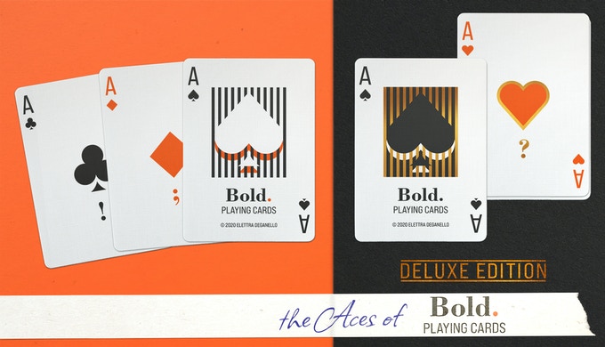
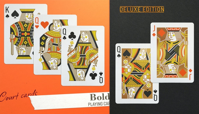
Elettra thus reinterprets the traditional scheme of playing cards with endearing designs that denote high doses of sensitivity and careful staging. Everything in the deck has been rebuilt with simpler shapes and lighter shades of classic colors. Winks to typography are present in many corners decorating aces or forming, with the use of commas or question marks, the facial features of court cards.

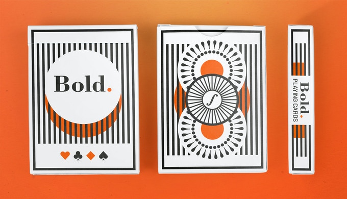
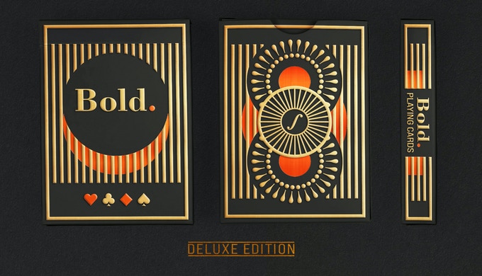
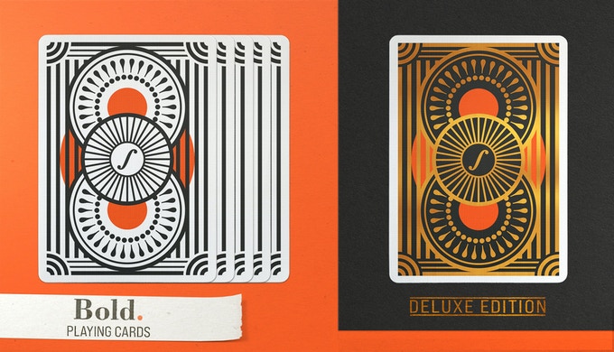
The back reimagines a classic made up of wheels with typographic symbols and very thick black lines. Simple, symmetrical and elegant.

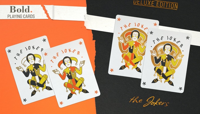
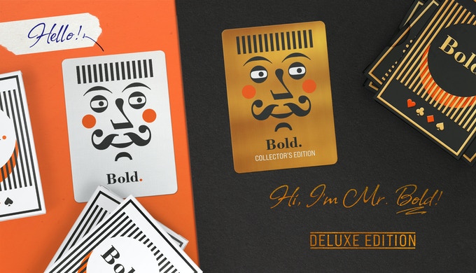
The game with the typography continues with the jokers, which juggle letters, and with Mr. Bold, the character of the extra card whose face is made up exclusively of typos.

Two different editions have been created with complementary color schemes. The Bold edition with a white case and black and orange designs and the Bold Deluxe edition, with a more elegant case in matte black paper, two foils in red and gold and gold metallic ink on the court cards.
The decks will be printed by the USPCC and it is possible to get some special boxes with different previous creations by Elettra.
If you want to support the artist and get these lovely decks, visit the project website and raise your pledge.
Good luck!


