
New decks by ART OF PLAY. Cardistry, magic and collecting with awesome elegance
Summer and vacations are over in many countries and the return to reality, work, school, routine is inevitable… However, Max Playing Cards is here again to offer you a new installment of decks with quality , elegance and carefully design… three words always linked to a brand: ART OF PLAY.
Since the latest news last Christmas, Art Of Play has launched many new decks in collaboration with different artists. Here are some examples that may interest you.
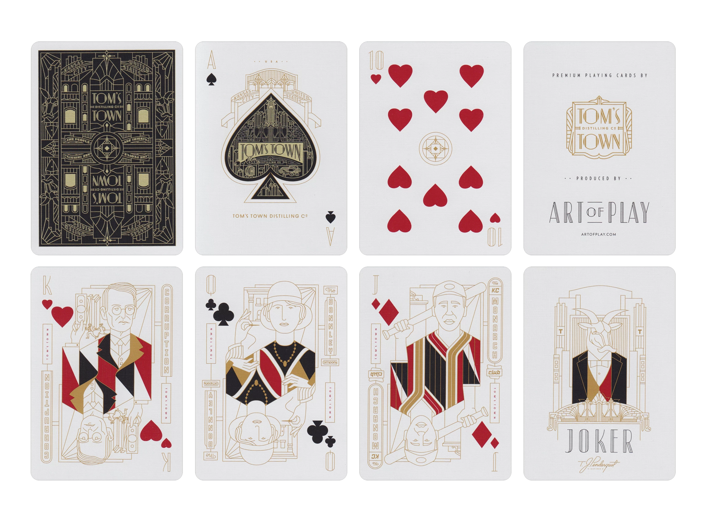
TOM’S TOWN
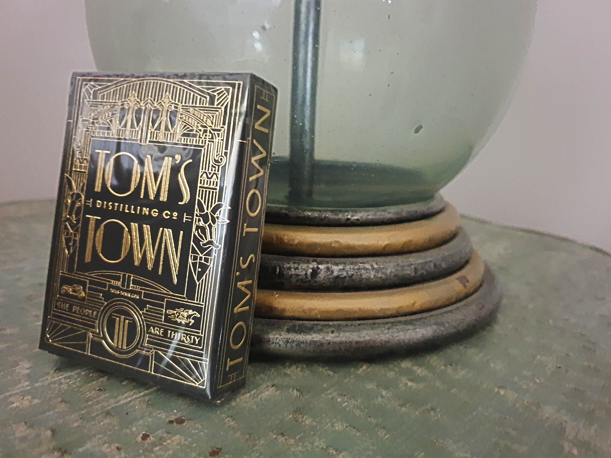
This deck arises from the collaboration of Art Of Play with the well-known Tom’s Town Distillery in Kansas City.
For the illustration, the artist Kevin Cantrell has taken as reference the aesthetics used by the distillery in their bottled products, with an elegant and linear art deco style that will add glamor and luxury to any poker night. The bordered back and white backgrounds also make it perfect for any card magic trick.
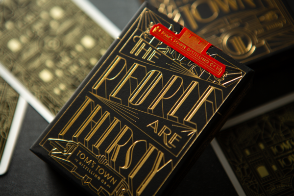
El estuche lleno de relieves y estampados metálicos dorados sobre el papel negro crea un bello contraste y añade además un bonito sello personalizado de color rojo. El eslogan de la destilería “La gente está sedienta” decora el dorso del estuche.
The tuck case, full of embossing and gold foiling on black stock creates a beautiful contrast and also adds a nice red custom seal. The slogan of the company “The people are thirsty” decorates the back of the tuck case.
Printed by the USPCC in the Art of Play’s trademark thin-stock preferred by cardists. Get it in Art Of Play.
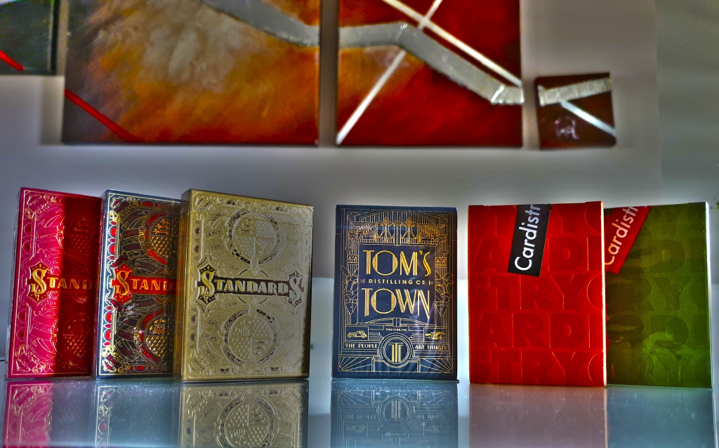
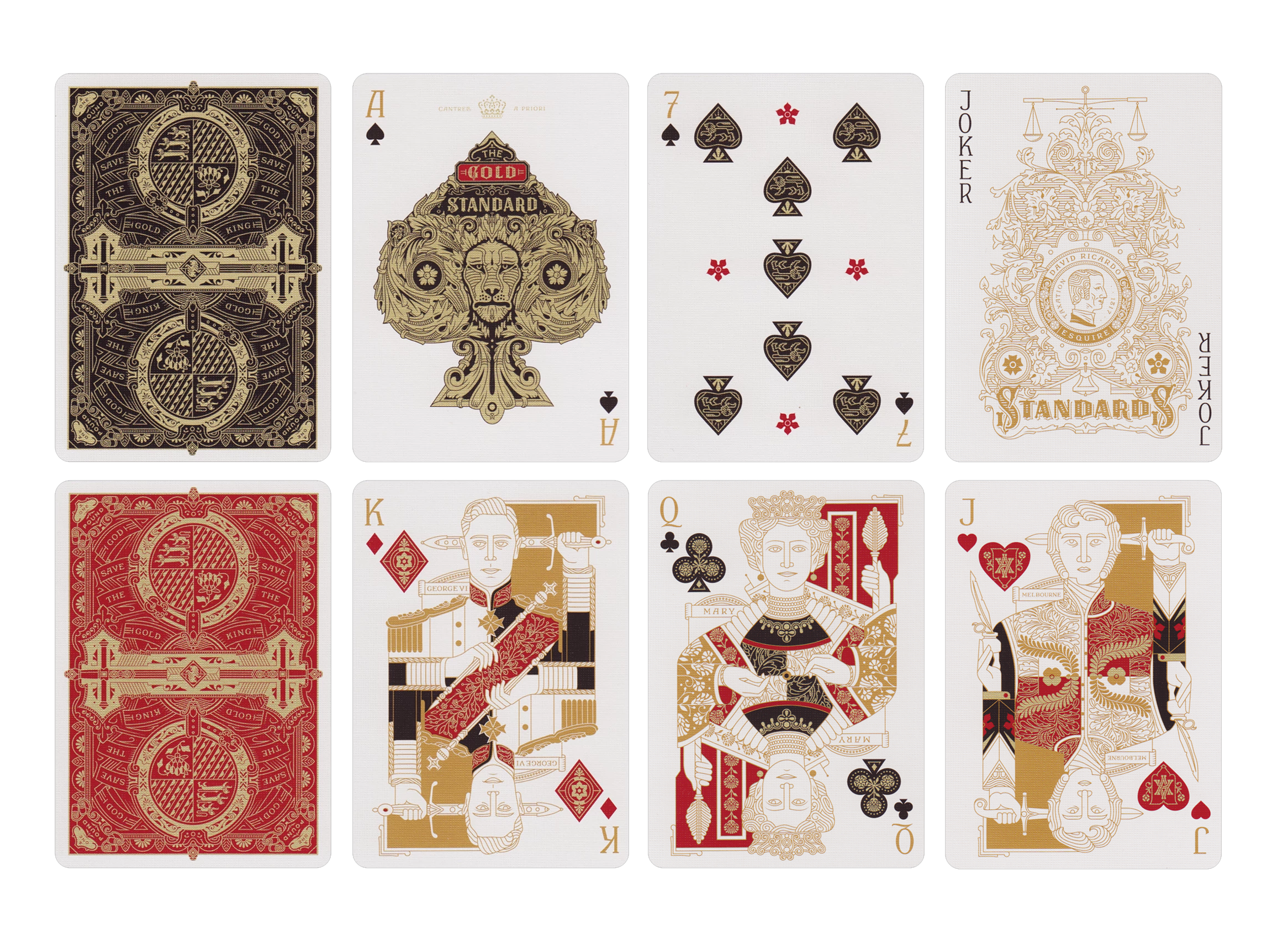
STANDARDS
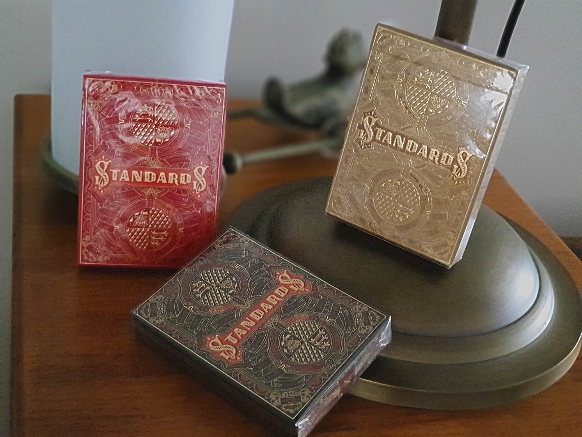
The name of these decks is a pure contradiction. Their high elaboration and customization make them unique collector’s pieces.
Again Art Of Play collaborates with the studio of designer Kevin Cantrell whose drawings with clean but detailed lines completely betray their creator. These illustrations are inspired by the splendor of the British Victorian era with high birth characters and high graphic ornamentation.
The tuck cases are a work of goldsmithing with embossing and gold foil inside and outside on black and red stock, the same colors in the backs of the two editions available. There is also a limited Gold edition that was only available to those who purchased a Bespoke Box Set already sold out.

Printed by the USPCC in the Art of Play’s trademark thin-stock , red and black editions are available in Art Of Play.
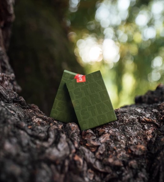
CARDISTRY-CON 2019
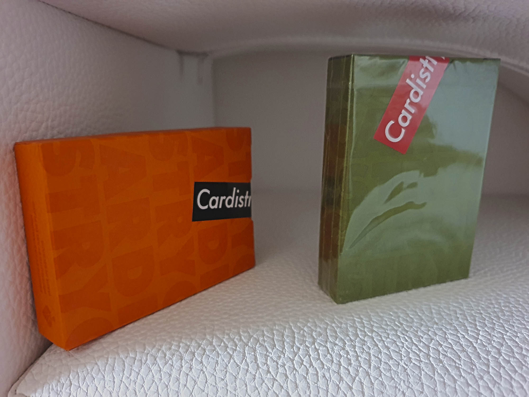
Cardistry-Con is an annual convention dedicated to the world of cardistry, organized for the first time in 2014 by Dan and Dave and in which competitions, conferences, workshops and many other events are held. The official decks offered to attendees are launched every year. For those who have not had the fortune of being in Portland between July 19 and 21 this year, they can now get them through Art Of Play.
These decks created by the most famous brothers in the world of magic and cardistry, have a retro design and play with geometry to provide colorful effects in their manipulation.

The deck has a quite visual asymmetrical white bordered back and the ace of spades has been customized. The rest of the cards have standard faces.
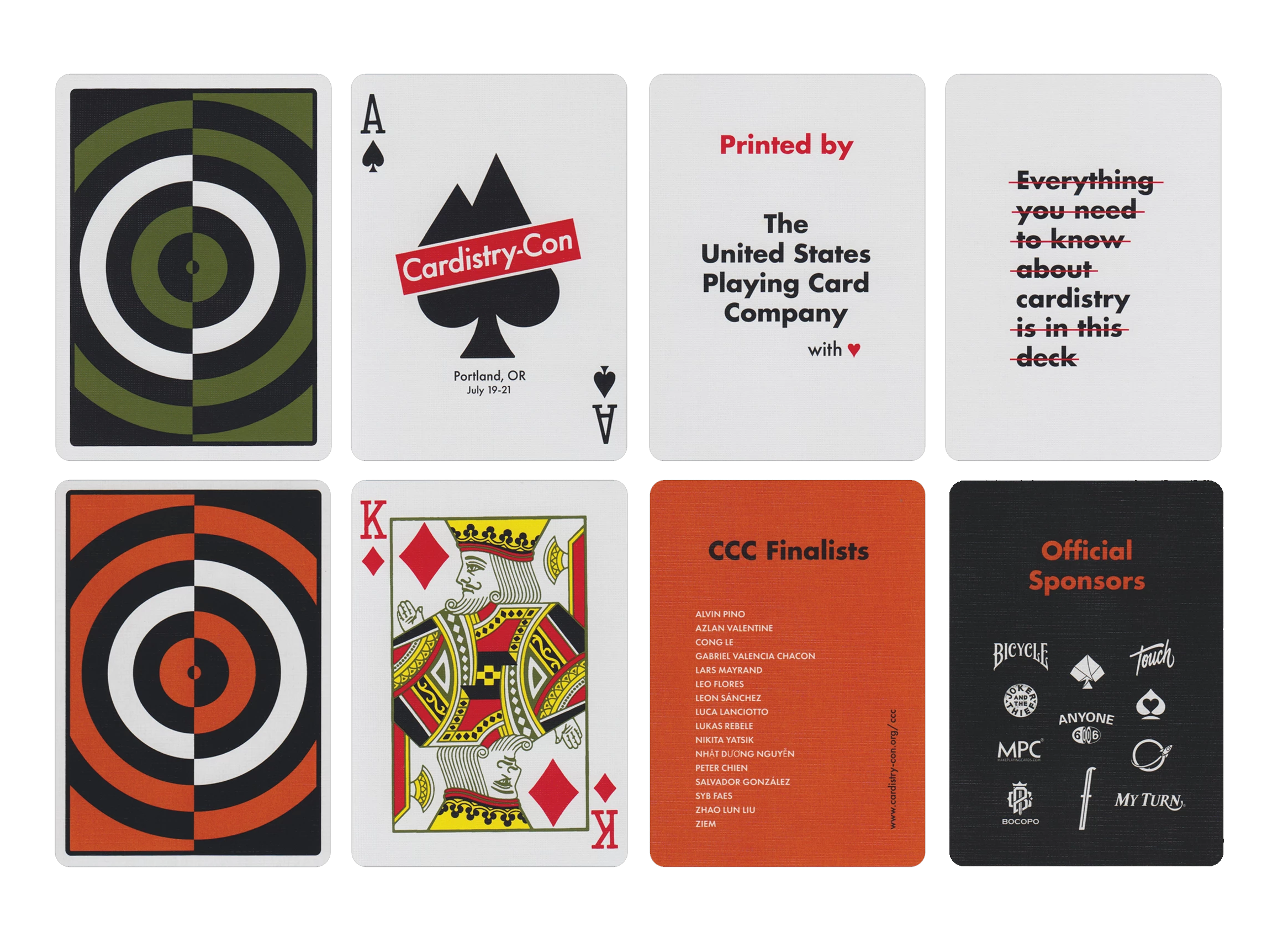
The official deck, in green, was made by the USPCC in a limited edition of 5000 units printed with vegetable-based inks and eco-friendly paper obtained from sustainable forests. Only half of them have been offered to be bought online.

In addition to the green edition, Cartamundi printed a special deck (the CCC Edition) in orange and was given to convention attendees. Although it is not for direct sale, if you buy a brick (12) of the green decks, one of the CCC decks will automatically be added to your cart. You can get them at Art Of Play.
As you can see, there is a lot to choose from. In future articles I will go on telling you about novelties by Art Of Play.
Enjoy your cards … but with art!


