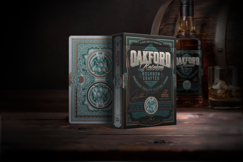
OAKFORD RESERVES Playing Cards. A deck that distills American history
The aesthetic of old American distilleries, with their intricate labels, tax stamps, and Victorian typography, possesses an undeniable charm. That visual universe, deeply rooted in the culture of the Prohibition era and bootlegging, is the setting chosen by Jody Eklund for his latest work: OAKFORD RESERVES.
By now, followers of Black Ink Playing Cards know exactly what to expect from Jody. Far from settling, the artist continues to demonstrate an astonishing ability to research and translate historical themes into the traditional playing card format. Those of us who know his trajectory a bit closer know that a few years ago he moved to Tennessee, the historical heart of American whiskey. It is no wonder, then, that the deep culture of master distillers and oak barrels that permeates that land has ended up inspiring this new tribute to special reserve bottles.
The campaign is built around three editions, designed to scale in luxury and finishes. The House Sellers edition serves as a starting point, highlighting the original art through the use of metallic inks on the faces of the cards. A step further we find the Heritage Limited edition, which replaces the inks with a spectacular cold foil finish applied to both sides, giving the deck very striking reflections. Finally, the Founders Select edition maintains that cold foil background but adds eye-catching metallic edges (gilded) in an intense emerald green color.
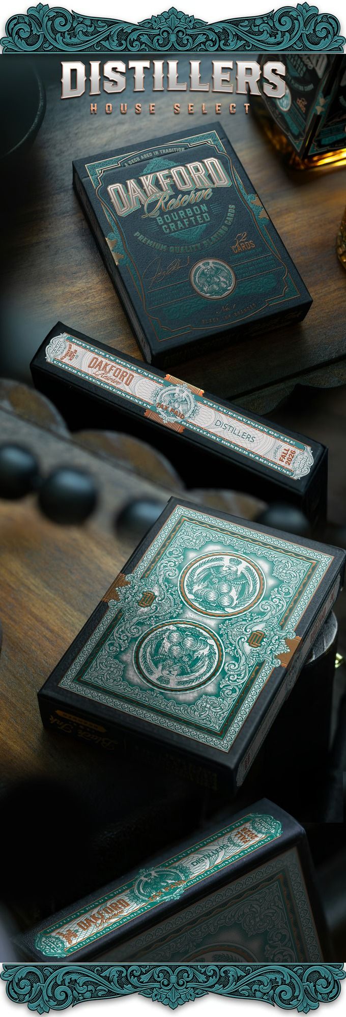
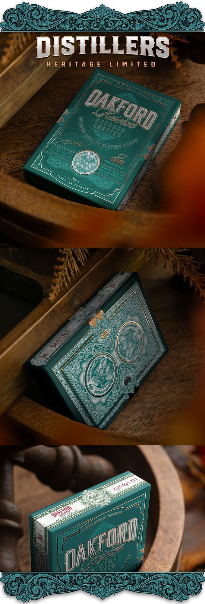
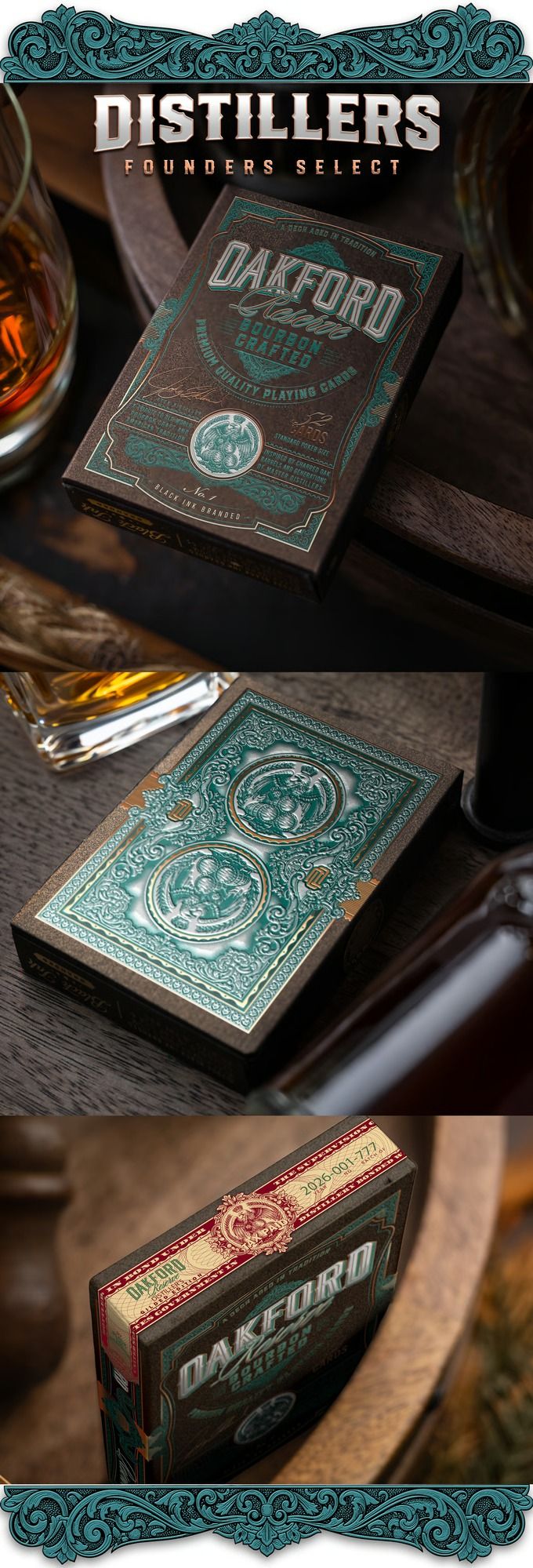
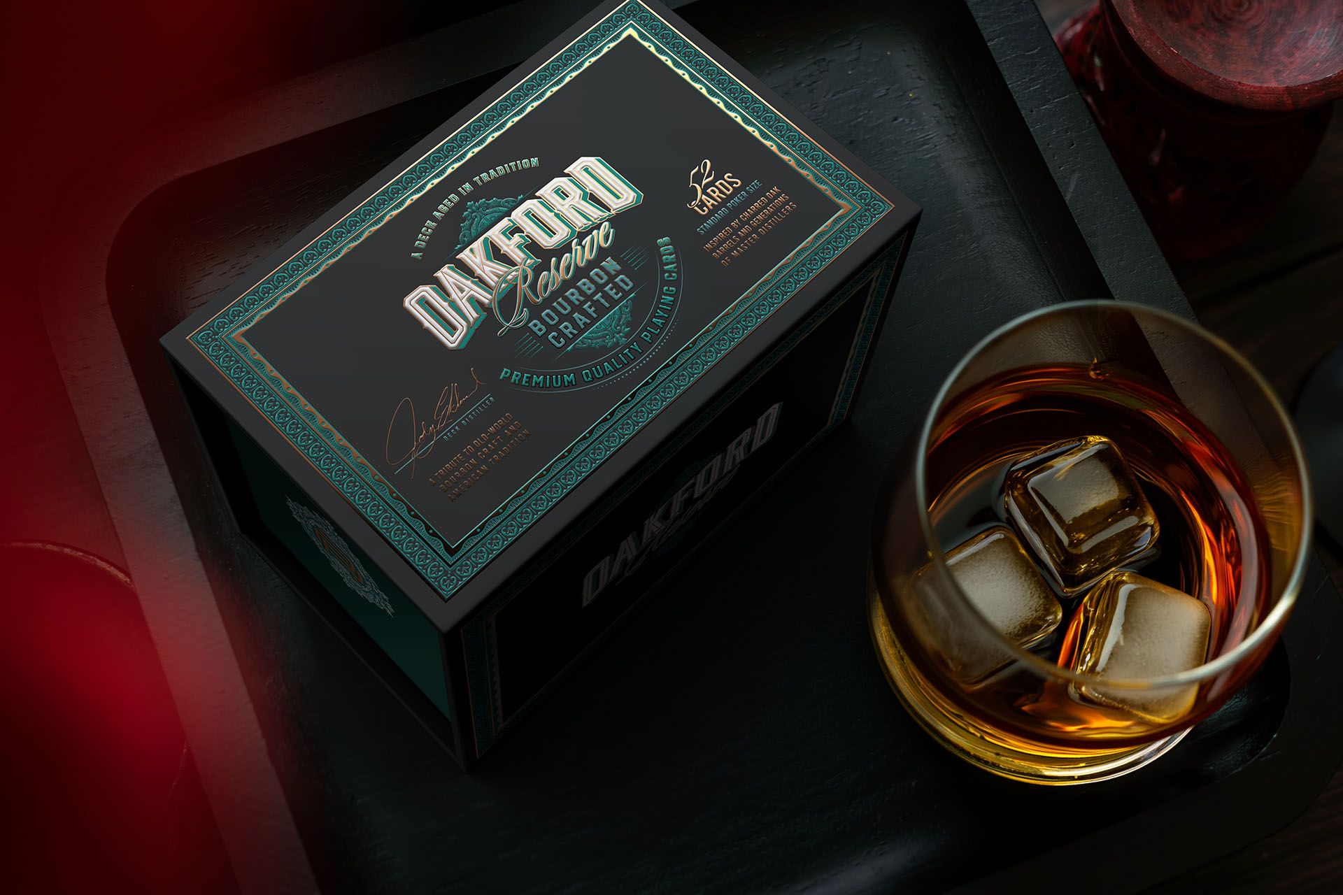
In addition, the project offers the Distiller’s Legacy set, a collector’s box with a magnetic closure designed to display the three decks together.

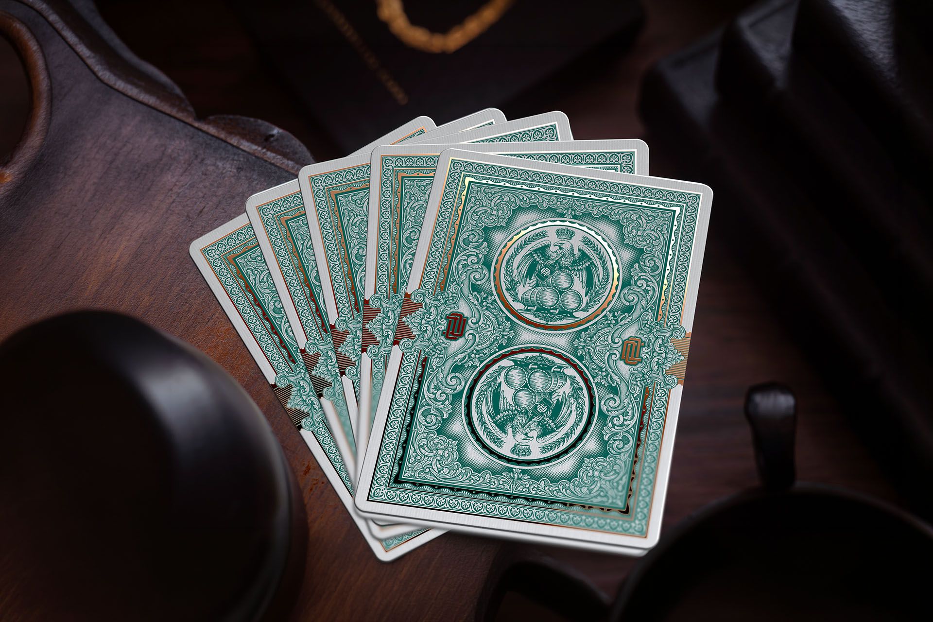
Focusing on the card art, the backs are a direct tribute to early 20th-century graphic design. Jody has composed a symmetrical back combining elements typical of alcohol tax bands, wax seals, and watermarks of aged bottles. In the higher editions, the application of cold foil makes this framework stand out enormously when interacting with the light.
For the court cards, the designer has dispensed with classic royalty to illustrate a cast of characters typical of the era. Instead of conventional kings and queens, we find portraits of distillation pioneers, bootleggers, and matriarchs of families who built empires around oak barrels. The illustrations combine sepia and aged tones with metallic touches, achieving a very convincing period document look.
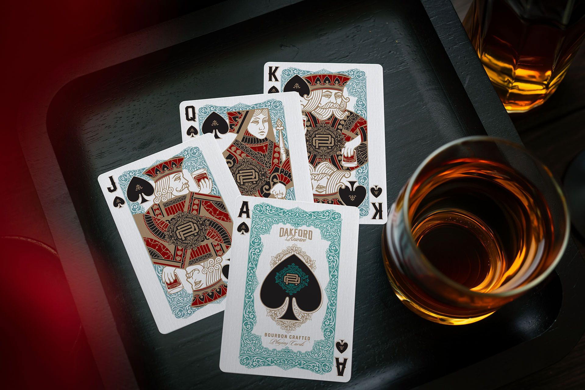
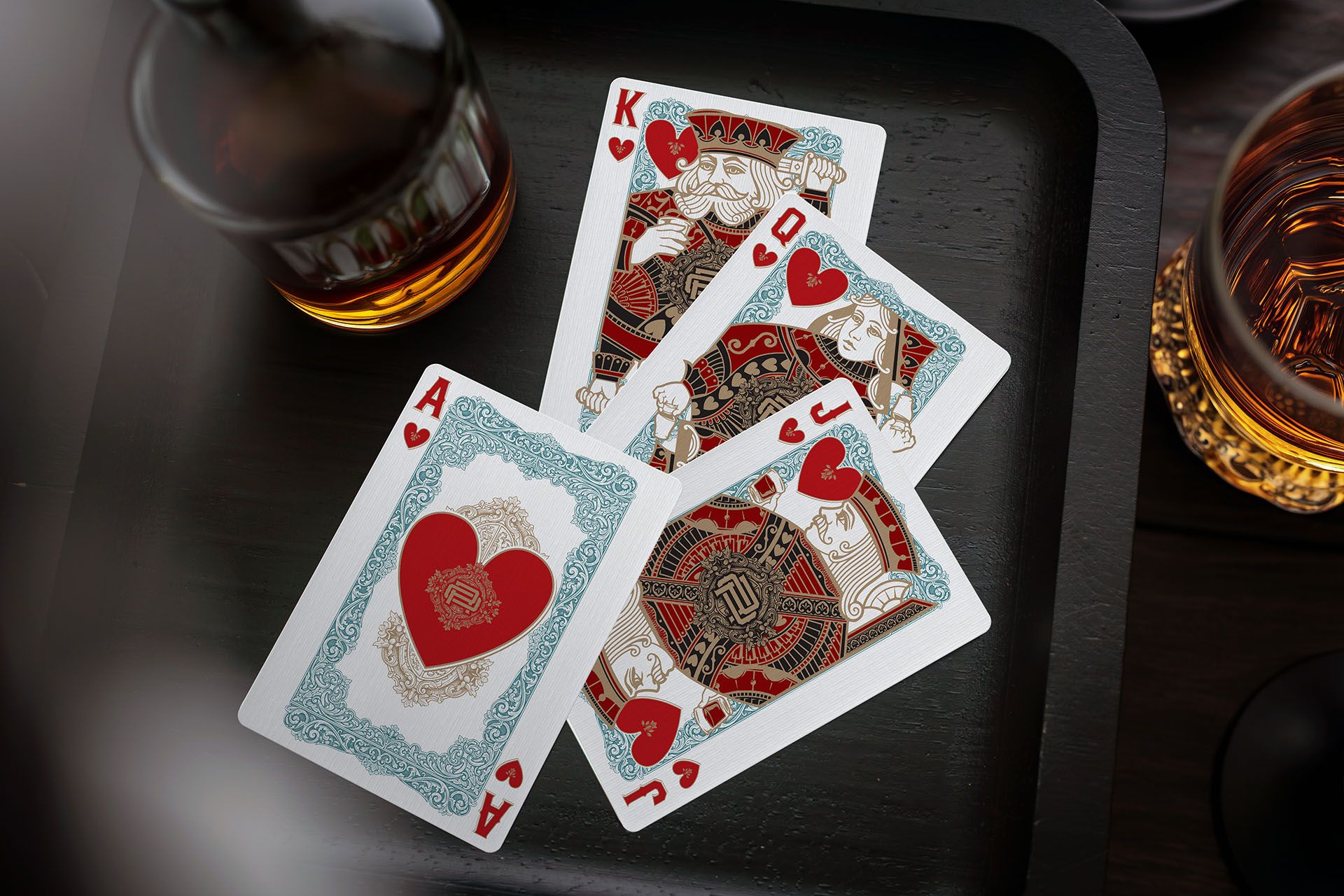
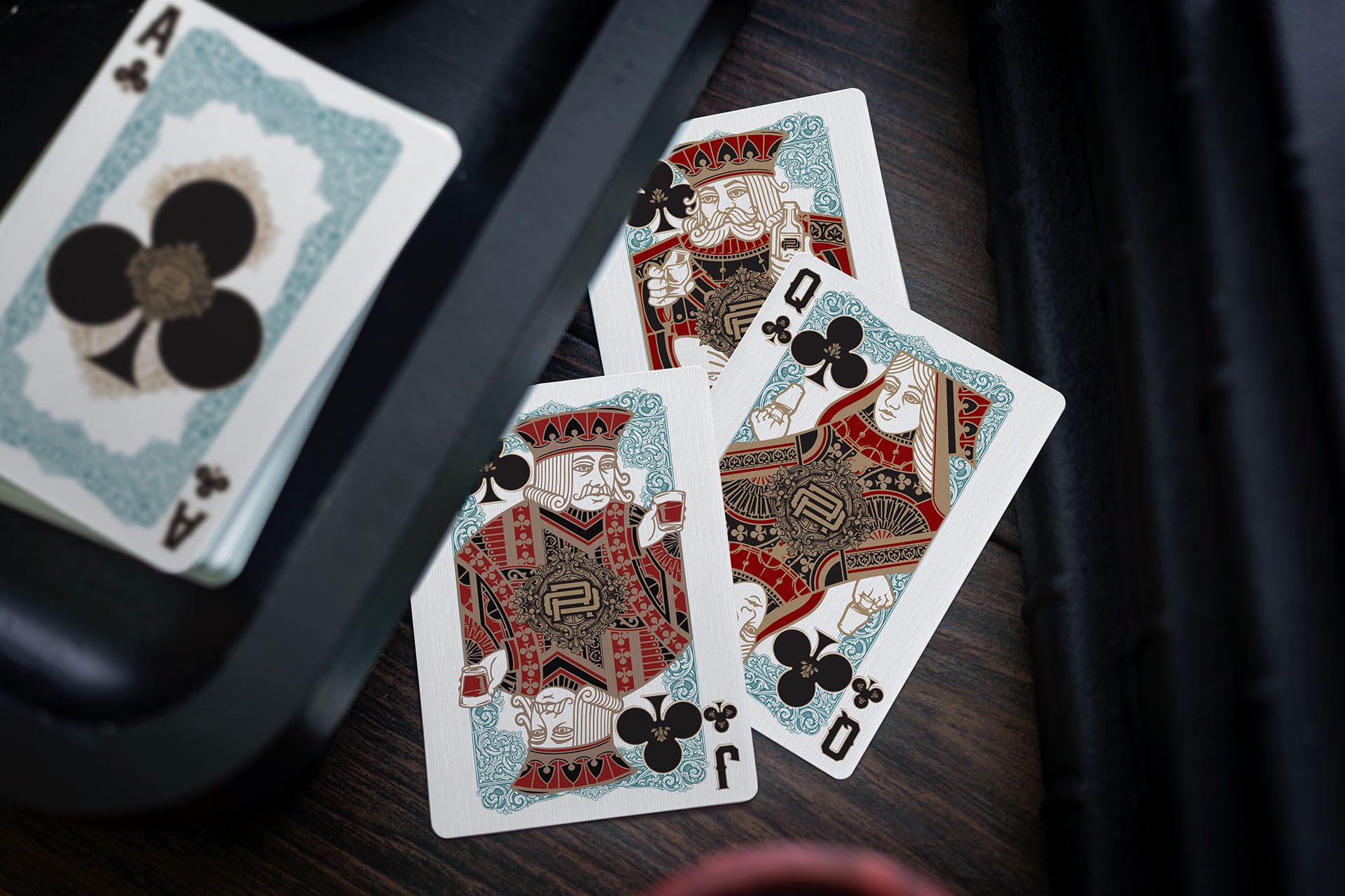
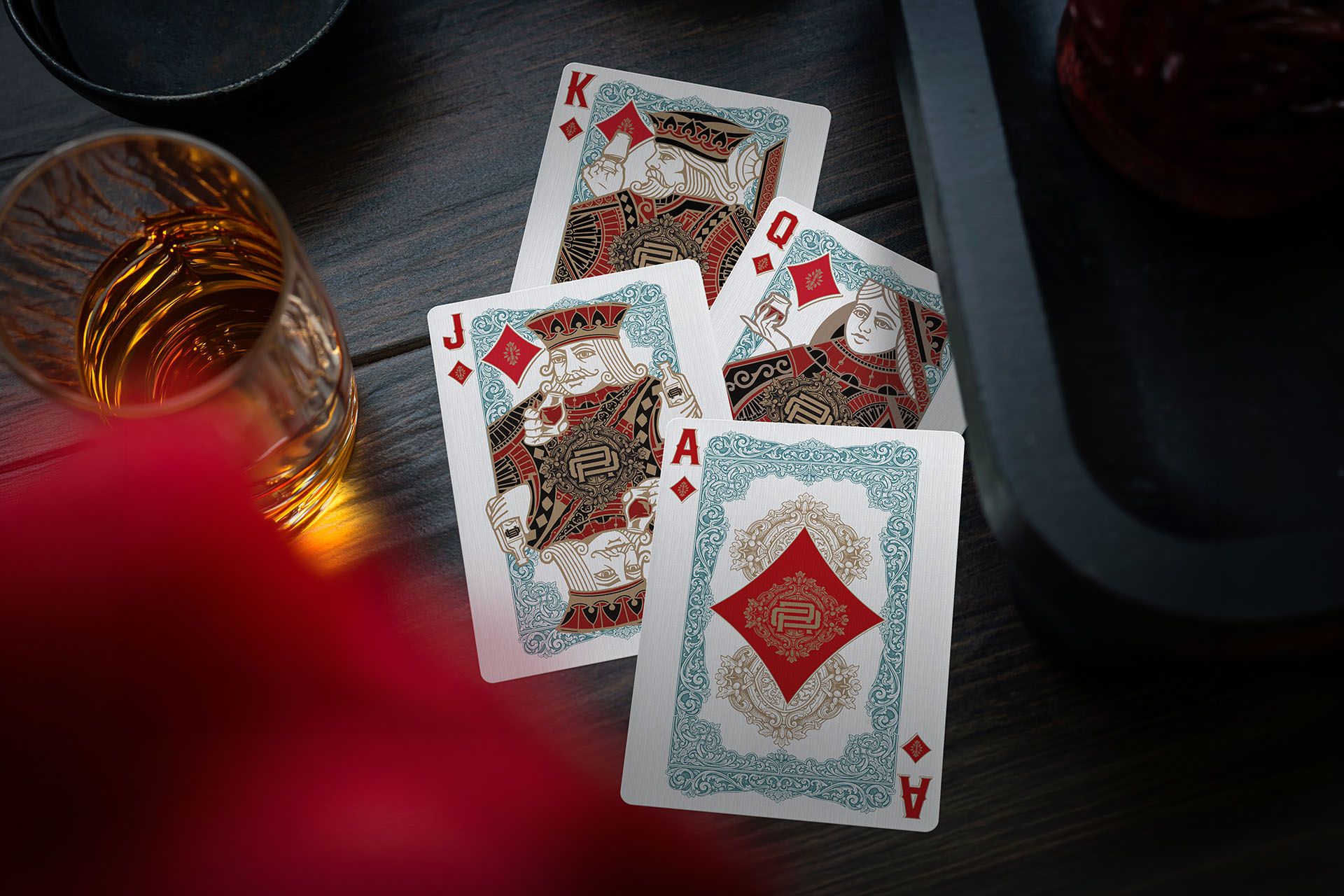
The aces maintain visual coherence with large, ornate spades and hearts, integrating architectural motifs and copper stills inside.
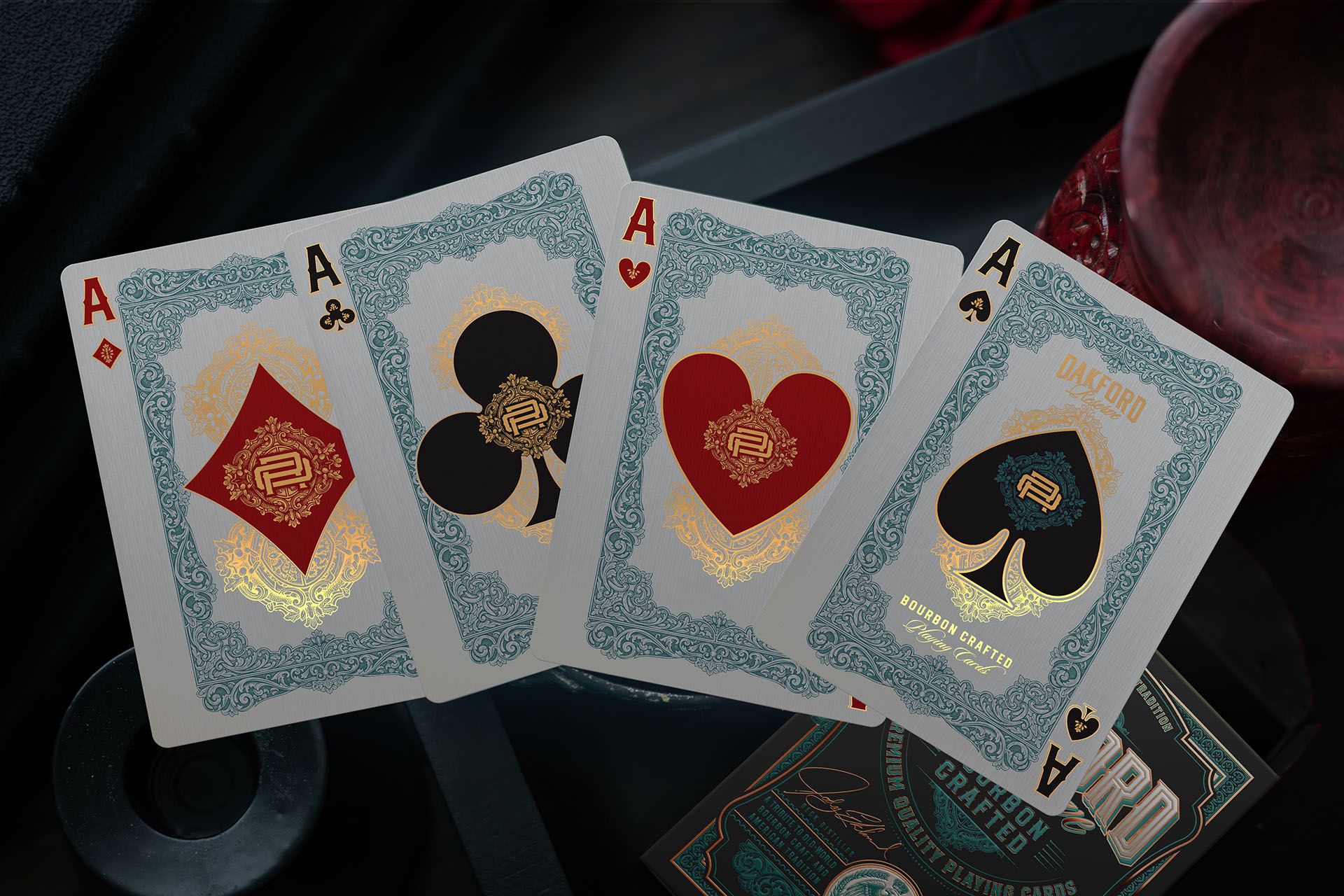
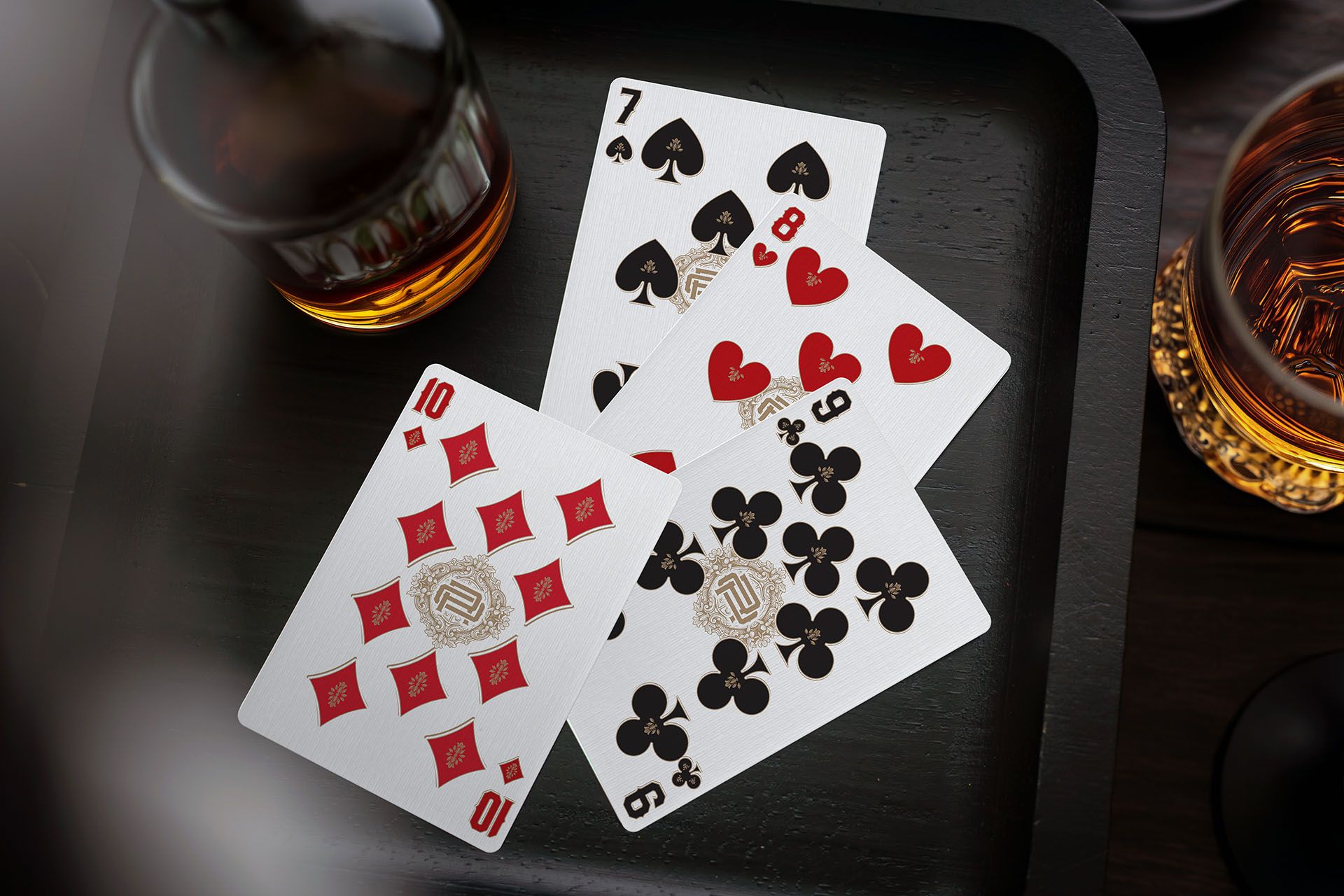
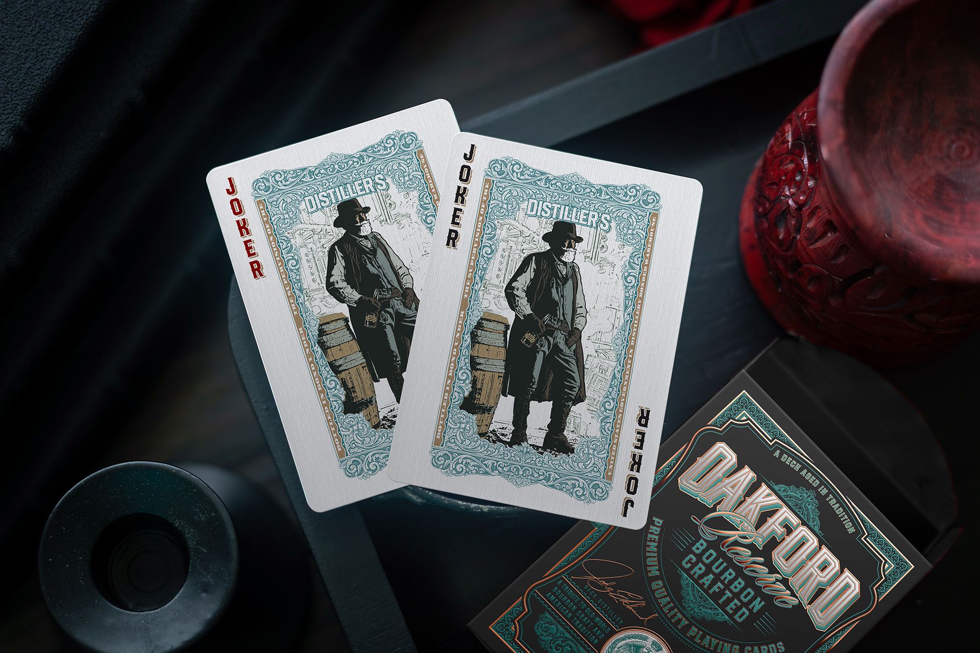
This attention to detail is maintained in the fully custom numbered cards, and in the jokers, which round off the deck’s theme and add the final touch of historical context to the collection.
For production, Jody has once again trusted WJPC. This choice ensures premium paper with smooth and durable handling, in addition to the use of eco-friendly materials, something the creator wanted to highlight in this campaign. It is the ideal combination to support complex metallic finishes without sacrificing the feel of the cards.
The campaign is already widely funded and unlocking stretch goals. If you are drawn to the history of American liquor and classic design, you can visit the project website and make your pledge.
Good luck!