EPHEMERID Playing Cards. Much more than a typographic deck
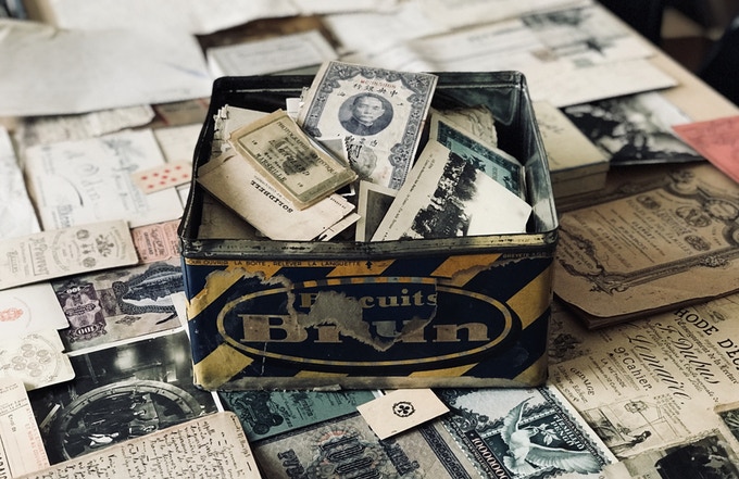
Graphic designer, entrepreneur, adventurer, collector, blogger, … The human being behind this new deck is simply amazing. Fabien Barral (Mr. Cup) has been working for many years in the graphic design world and has already carried out successful crowdfunding campaigns because he really relies on personal relationships as the key to a good project. As a collector, Fabien has been picking up thousands of transitory items printed in paper (ephemera) throughout his life, such as tickets, bookmarks or letters. He wanted to mix collecting and design in a deck and he has done it very wisely in EPHEMERID.
A very personal style is revealed in these cards, whose essence is found in one of the greatest hobbies of the designer: letterpress. This technique is based on relief printing from a template made in metal. Letterpress represents the very origin of the printing press and today has that wonderful flavor of traditional craftsmanship put at the service of art creation on paper.
The campaign developed by Mr Cup also recovers the essence of Kickstarter, in which a creator offers a product in development, adaptable to the needs and feedback of its backers, with passion and taste for detail. The truth is that the strategy has worked and the project, in a few days, has been a true success.

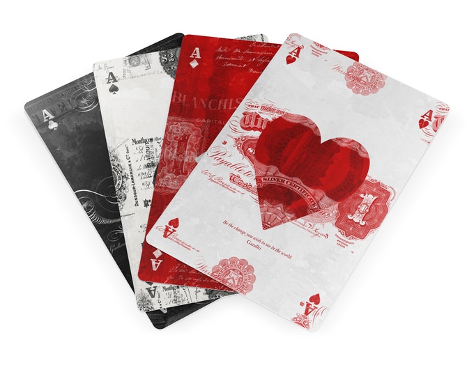
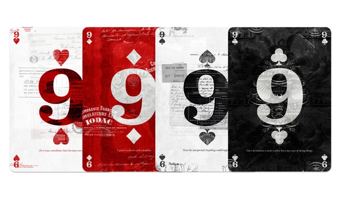
Each card is a collage where the traditional symbology (suits, indexes, numbers, …) is combined with real objects from the artist’s collection in a very careful and quite original aesthetic, replacing the traditional pips by large numbers. Each card also shows an inspiring quote for a daily reflection.
Historical characters will be part of the court cards. Only the spades have been created so far (the rest will be arriving throughout the campaign).

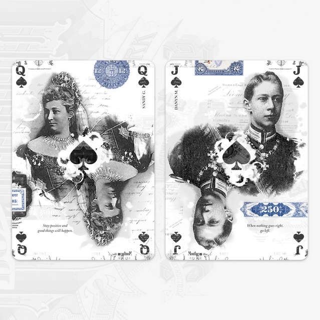
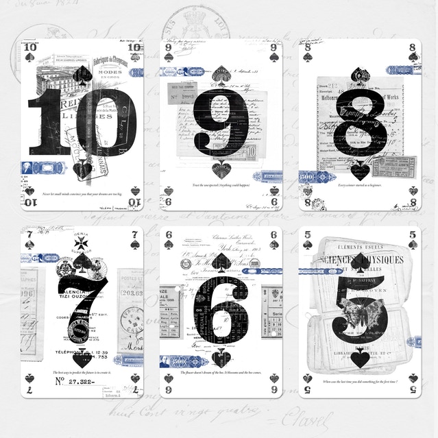
Fabien wanted to transfer a part of his personality to the cards and thus, due to his dyslexia, he decided to make four different color combinations to distinguish between both red and black suits easier. In addition, being ambidextrous, the indexes are in the four corners facilitating the game for left-handed and right-handed people.
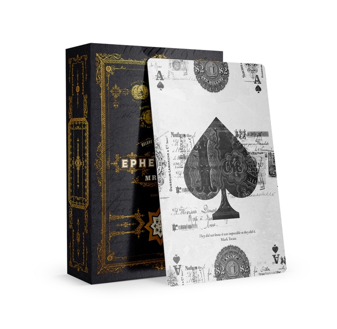
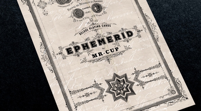
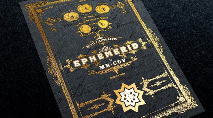
About the tuck case, they will actually be two different. A standard edition, printed on white paper and four colors and a Deluxe edition made on black paper with white and gold foil and embossed using made in France letterpress. Fabien is still deciding about the printer but it is probable that he uses NPCC to print the cards and the standard tuck cases trying to offer the best quality and price combination.
Without a doubt, a very interesting campaign. If you like it, visit the project website and raise your pledge.
Good luck!