
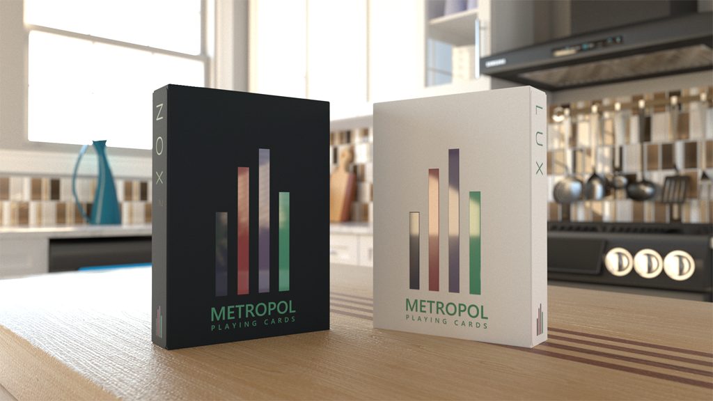
METROPOL NOX and LUX 2017. The traditional minimalism with shiny finish
In the last months, playing cards creation has experienced a strong explosion of minimalist and geometric designs specially oriented to cardistry fans. However these designs are not new and we can find pretty good referents that can be considered the origins of this type of decks. One of the most obvious cases is the Metropol Playing Cards, created by Mike Lambert (Metropol Cards) and whose first NOX edition was launched in 2013, followed by the LUX edition in 2104. Three years later, Mike strikes back with his METROPOL NOX and LUX 2017 Playing Cards.
If the first NOX deck, printed by the USPCC, was characterized by its fluorescent colors on black background and the original LUX, in its three editions printed by LPCC, used different color palettes on white backgrounds, Mike has unified the colors for the new versions of NOX and LUX 2017 using black and white backgrounds respectively.
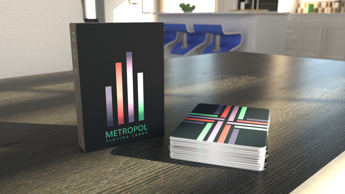
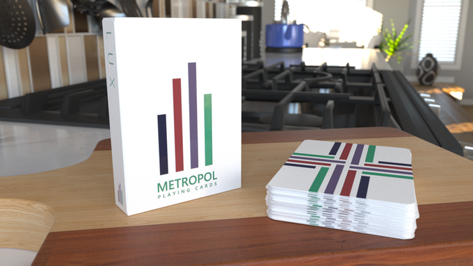
The main novelty of these editions is that they will use UV ink on the card back and the tuck case, a glossy layer that will highlight the colors even more and will give the deck a much more attractive appearance.
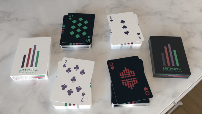
The decks will be printed by LPCC using their Emeral finish.
If you like the minimalist design with intense colors, these are your deck. Visit the project website and raise your pledge.
Good luck!


